Instructions & Guidelines for e-Poster Presentation
e-Poster Format Guidelines
The presentation will be showcased on an interactive electronic poster board, allowing you to seamlessly share your findings with conference attendees. Simply upload your poster prior to the meeting date, and you'll be ready to engage your audience with captivating visuals and insightful explanations.
Eligibility
The Conference E-poster Competition is open to researchers, scientists, and innovators from all disciplines. Eligibility criteria may vary depending on the specific conference, but some general guidelines include:
- Researchers: Individuals currently engaged in research activities, including graduate students, postdoctoral researchers, and faculty members.
- Scientists: Individuals with expertise in a particular scientific field, including researchers, professors, and industry professionals.
- Innovators: Individuals with a demonstrated ability to develop new ideas, technologies, or processes.
Submission Guidelines
- To submit your abstract for the E-poster Competition, please follow these guidelines:
- Abstract length: 300 words or less
- Format: Microsoft Word or PDF
- Include: Title, authors, affiliations, abstract text, and keywords
Judging Criteria
Visual Appeal
- Overall Design: The poster should have a visually appealing and organized design that effectively conveys the research findings.
- Use of Graphics: Images, charts, and graphs should be clear, relevant, and enhance the presentation of the research.
- Color Palette: The color scheme should be visually appealing and complement the overall design of the poster.
- Font Choice: The font style and size should be easy to read and consistent throughout the poster.
Content Clarity
- Title: The title should be clear, concise, and accurately reflect the content of the research.
- Abstract: The abstract should provide a concise overview of the research, including the purpose, methodology, findings, and conclusions.
- Introduction: The introduction should clearly state the problem or question that the research addresses.
- Methodology: The methodology should describe the methods and materials used in the research in a clear and concise manner.
- Results: The results should present the findings of the research in a clear and organized manner, using tables, graphs, and other visuals when appropriate.
- Discussion: The discussion should interpret the findings of the research and discuss their implications.
- Conclusion: The conclusion should summarize the main findings of the research and state the significance of the work.
Originality and Significance
- Originality of Research: The research presented should be original and contribute to the advancement of knowledge in the field.
- Significance of Findings: The findings of the research should be significant and have the potential to impact the field or society.
Overall Impression
- Overall Quality: The overall quality of the e-poster should be high, with no grammatical errors or typos.
- Engagement: The e-poster should be engaging and effectively communicate the research findings to the audience.
- Professionalism: The e-poster should be presented in a professional manner and reflect the high standards of the research
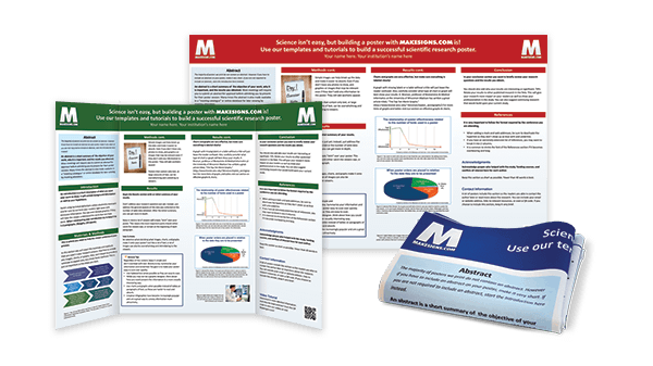
e-Poster Layout and Design:
- Divide the poster into clear sections: The poster should be divided into clear sections, such as Introduction, Methods, Results, Discussion, Conclusions, and Literature Cited. This will make it easier for viewers to navigate the information.
- Use a consistent grid: Use a consistent grid to align the text and visuals on the poster. This will create a visually appealing and organized layout.
- Leave white space: Leave white space around the text and visuals to avoid a cluttered appearance. White space makes it easier for viewers to focus on the important information.
- Use a hierarchical font scheme: Use a hierarchical font scheme to emphasize the different levels of information on the poster. For example, use a larger font size for the title and headings, and a smaller font size for the body text.
- Use a consistent font style: Use a consistent font style throughout the poster to create a cohesive look.
- Align the text and visuals: Align the text and visuals carefully to create a polished and professional look.
- Use a simple and clean design: Use a simple and clean design that is easy on the eye. Avoid using too many colors, fonts, or graphics.
- Use a consistent color scheme: Use a consistent color scheme that is complementary and visually appealing. Avoid using too many colors, as this can make the poster look cluttered.
- Use high-quality images and graphics: Use high-quality images and graphics that are relevant to the research. Avoid using low-resolution images or clip art.
- Use captions for images and graphics: Use captions to explain the meaning of images and graphics. This will help viewers understand the information.
- Use a consistent style for citations: Use a consistent style for citations, such as APA or MLA style.
